
After I had offset the CO2 emissions of our family summer vacation, I also wanted to better understand what more we could do personally to cut our emissions. I found all sorts of resources on the web, but they seemed either much too broad or much too narrow in focus.

Instead, I was looking for a concise, quantitative, prioritized list of key CO2 emission sources that I could concentrate on. I was so intrigued by this idea I even drafted a dummy version (see screenshot below):
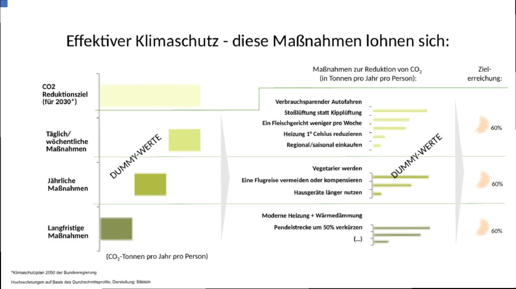
A number of specialized NGOs I contacted with this dummy version really liked the concept, but did not have anything ready to share. So I ended up researching the facts myself during one internal meeting that was particularly boring.
Turns out there is an incredible amount of well-researched data on CO2 emissions available out there at your fingertips! However, you really have to be a data-savvy expert to make sense of it! So I invested a few hours to research the most important facts and compiled them in a simple spreadsheet. Then I had an enthusiastic colleague (Carsten) help me out triple checking the facts and expanding the list.
That initial analysis contained quite a few surprises for me personally: For example, I had substantially under-estimated the CO2 impact of switching to a vegetarian diet! And I was very surprised to learn that avoiding plastic bags had basically zero impact on my CO2 emissions.
I started wondering if my fellow citizens had the same misconceptions on what were the key levers to cut personal CO2 emissions. Since easy-to-use insights were inaccessible and most lists lacked numbers, it seemed only natural that everyone would be just as clueless as myself.
Five surveys (with a total of more than 6,000 respondents in four countries) later, we were able to confirm that hypothesis! Our most striking finding: People across the world believe that avoiding plastic bags is actually by far the most important personal lever to cut CO2 emissions.
When we published those findings in a simple blog post on LinkedIn, things got really wild: the post generated 10x more views than my next best post and its core graph gathered thousands of likes on Reddit within a few hours. Within a few days, the story got picked up by multiple national media outlets as well as a few international ones like Wired UK or Treehugger.

The most beautiful and fun implementation of our findings was done by Handelsblatt, Germany’s leading business daily: Not only did they publish our insights in their “graph of the day” category covering two full pages, but they also created an animated version here.
